As a Consultant, one has to work
extensively with Excel and PowerPoint. These two software, probably consume most of the working time of a consultant. Preparing good presentations is a crucial skill that any consultant must muster. One of the most important aspect of
a good presentation if its visual appeal. One may choose to call it aesthetics or
simplicity or refined or sophisticated or anything else. The point remains that visual appeal is a must for any good presentation. A good presentation also is the one which
brings out the intended message with clarity and simplicity.
This brings us to Charts. One of the most crucial component of the presentation
is Charts & Graphs. Data analysis and number crunching is integral to a
consultant’s recommendation. Any recommendation holds water only when it is
backed by solid research and the data which supports the hypothesis.
So, let us see what makes up good charts. A good chart has to be SUAVE.
•
Simple
o
The chart has to be simple. Devoid of all unnecessary clutter. As much as the job of the chart is to
highlight only the important information, it is also necessary that the
chart makes enough effort to remove any information that is 1. redundant and 2. has potential to distract the viewer.
•
Uniform
o
The chart has to have
uniformity. Be it in the choice of colors or size of chart components, or
alignment or use of fonts. The chart has to be formatted in a way that shows
uniformity, symmetry, consistency.
•
Arranged and Ordered
o
This is a very important aspect
that many miss out on. The chart category has to be
arranged and ordered by using some logic. This logic can be:
→ Numeric order
→ Alphabetical
→ Chronological
→ Geographic (e.g. distance of cities from
Mumbai. Pune will come first, then Nagpur, then Kolkata and then Imphal)
→ Any other
It is important to note that,
human brain is programmed and tuned to recognize patterns. An ordered,
symmetric design attracts mind’s attention quickly. The human brain
understands sequential and ordered information easily than randomly arranged data.
•
Visually Appealing
o
The chart has to be visually
appealing. The choice of colors, contract, effects used and effects
deliberately avoided (e.g. 3D effect) all contribute to visual appeal of the
charts. A visually appealing chart can have make or break effect on driving
home the intended recommendation.
•
Expressive
o
Any chart in the presentation
has to have an objective. If the chart fails to self-explain that objective, then the
chart has lost its purpose. It is hence that the chart has to be expressive. It
has to use components like highlighting necessary point, contrasting, effects, etc. to be more expressive. A chart that is so lost in the background
that it fails to stand out serves no purpose.
Once we have
understood that any chart in your presentation has to have SUAVE, now its time
to understand the 6 point rule to create SUAVE charts. I am also going to
explain in detail, various tips and tricks you can use to create such charts.
So lets get on it.
1. Choose the right chart
The first and
most important aspect is to choose the right chart. Every chart type has brings
out specific point and has a story to tell. Hence it is very important that we
select a right chart type. While making this decision, I always resort to ExtremePresentation.
This is my go-to tool.
2. Clear All Clutter
The next step in creating SUAVE charts is to remove all clutter. When you
insert a chart by default in Excel or PowerPoint, it will have all sort of
components that are virtually clutter. Take for example, chart title,
gridlines, data labels. As a first step, remove all unnecessary
components.
3. Always Sort your Data
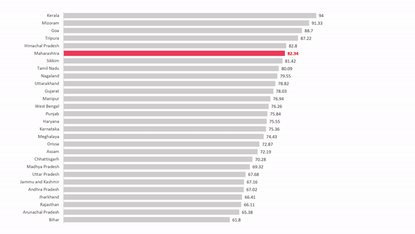
Another
important aspect is that you always sort your data. Ordered information is
easier to grasp and make sense of. While sorting data in charts, a pitfall that should be avoided is
wrong sorting. Take for example, the state wise literacy rate in India. It is
OK to sort the states alphabetically, however, it would make more sense if the
list is sorted in descending order of literacy rate. This will ensure that we
get a better sense of ranking of the state in question and give comparison at a
glance.
4. Highlight Relevant Information
Every chart has
a story to tell and every chart has a point to make. It is useful of you
highlight the point you want to make so that the chart becomes
self-explanatory. For example, if you want to highlight the data for any one
category, then color that information with a contrasting color. This will
reduce the burden from deliberately adding more information to explain the idea
you want to present.
5. Add an anchor
Adding anchors
or benchmarks increases the weight of the point you are trying to make. The human
mind finds it easier to make sense of the information if there is an anchor. Take
for example price movements of 2 stocks over time. Adding an anchor value of
average helps extract more sense out of the data at the same time adding more meaning to the
chart.
6. Give it some more thought!
Always give some additional thought to the point you are trying to
make through the chart. Ask yourself, does changing representation of the data
bring out the point your presentation is trying to make more effectively? What
is the best representation your data should have?
Take for example the literacy rate. We can arrange the data in the chart in descending order. Another way will be to compute the National Average and prepare a chart highlighting the gap from the national average literacy rate. This method brings out state's relative position as well as highlighting the categories that perform poorly categories that perform better than average.
 |
|
And finally, some Do's and Don't.
Do’s
|
Don’t
|
Follow a single color-scheme
throughout
|
Never use 3D effects
|
Delete legend in case of single category charts
|
Don’t use gridlines. They are distracting
|
Remove Chart title. Generally,
the title of the chart is present as
the title of the slide. Remove this element
if possible.
|
Don’t use default MS Office colors. They are too
mundane, and they strip your presentation of any character.
|
Insert Data Labels wherever possible. Having data
labels right next to the chart makes more sense as the viewer doesn’t need to
guess the value of the category.
|
Don’t add Data Table to your chart. If the data is
better represented as a table, then use a table only. In more cases than not,
the data is better represented as charts. If you make the chart
self-explanatory, there is no need to insert the Data Table.
|
Resize Chart Elements
|
Avoid using shadow, Blur, Bevel or any shape effects
for that matter.
|
Highlight relevant chart elements
|
|
Sort your data
|
|
Do share your comments here. Also, if you have any queries, feel free to reach out to me.


Comments
Post a Comment